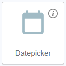
Datepicker is an element that allows selecting a particular date during form filling.
The date can be entered manually, or selected in the calendar. It can be placed only inside the Form Container.
Datepicker default state
After adding, the following settings are available for Datepicker in the Data tab:
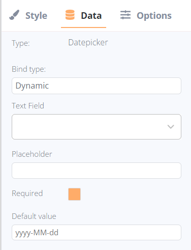
- Bind type:
- Text Field (available for dynamic bind type only): the list of available text fields in the current collection.
- Text (available for static bind type only): the field to enter the required text to display.
- Placeholder: it is substituted automatically based on the selected field’s name, or entered manually if a Static bind type was selected. The text can be modified in both binding options.
- Requires checkbox: the text element can be identified as required (the form could not be submitted until the field is filled) or non-required.
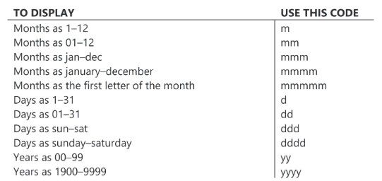
- Default value: the required date format can be set manually.