Text Area is an analog of the Text Box but designed for long texts (like descriptions). It can be placed only inside the Form Container.
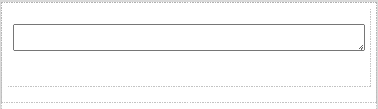
Text Area default state
Text Area has a length limit = 4000 chars.
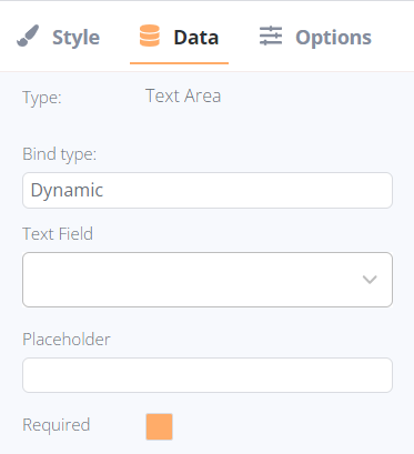
After adding, the following settings are available for Text Area in the Data tab:
- Bind type:
- Dynamic: it allows selecting a field from the data source to display it in the form accordingly. The field can be selected within the Form Container’s object.
- Static: it allows a static text setting; this text will be displayed permanently despite the selected record(-s).
- Dynamic: it allows selecting a field from the data source to display it in the form accordingly. The field can be selected within the Form Container’s object.
- Text Field (available for dynamic bind type only): the list of available text fields in the current collection.
- Text (available for static bind type only): the field to enter the required text to display.
- Placeholder: it is substituted automatically based on the selected field’s name, or entered manually if a Static bind type was selected. The text can be modified in both binding options.
- Requires checkbox: the text element can be identified as required (the form could not be submitted until the field is filled) or non-required.