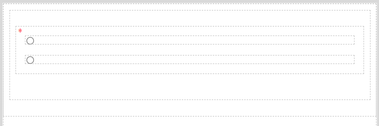
Radio Button is an element that allows the user to choose only one of a predefined set of mutually exclusive options. This element helps to make the form more sophisticated. Radio Button can be placed only inside the Form Container.
Radio Button default state
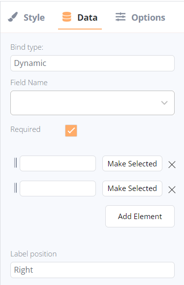
After adding, the following settings are available for Radio Button in the Data tab:
- Bind type:
- Text Field (available for dynamic bind type only): the list of available text fields in the current collection.
- Text (available for static bind type only): the field to enter the required text to display.
- Requires checkbox: the text element can be identified as required (the form could not be submitted until the field is filled) or non-required.
- Options: options for selection can be added with the “Add Element” button. The options can be marked as “selected” and “unselected”, dragged to change their position, and assigned with a text description.
- Label position: a position of the label text according to the Radio Button; the setting is applied to every option in the element:
- Submit: the form will be submitted after pressing;
- Clear form: all filled fields will be cleared after pressing.
- Submit: the form will be submitted after pressing;